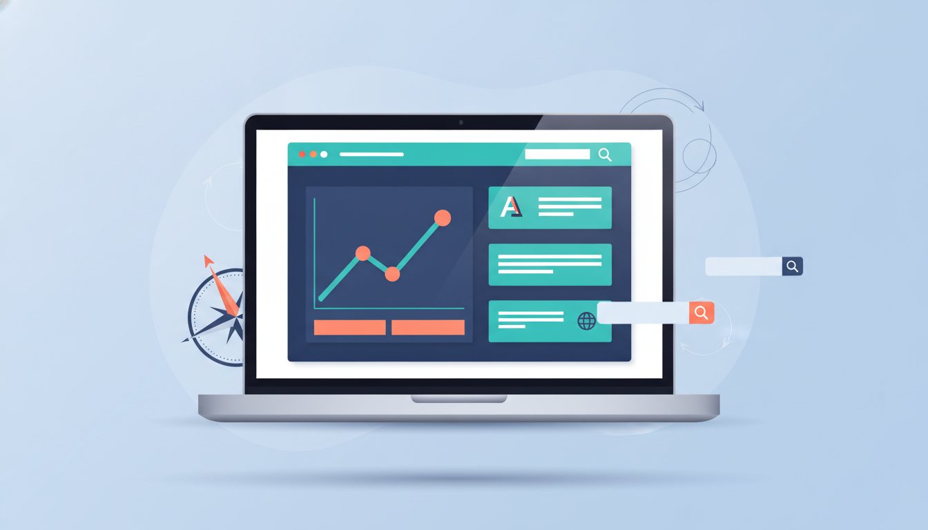
Building a WordPress website is easy. Building one that consistently turns attention into qualified conversations takes a system.
For small businesses, that system starts with a clear promise, a fast and accessible experience, useful search-driven content, and a frictionless next step. This guide turns those principles into a practical 2026 workflow you can apply without rebuilding your entire site.
What a small-business growth system needs to accomplish
A growth-focused website should answer four questions quickly:
- What do you offer?
- Who is it for?
- Why should a visitor trust you?
- What should they do next?
Those answers are connected. A vague headline makes navigation harder; slow pages weaken trust; thin content gives search engines little context; and an overcomplicated form loses ready-to-buy visitors. Treat the site as one journey rather than a collection of disconnected pages.
1. Start with a value proposition visitors can repeat

Your homepage headline should make the business legible in one glance. A useful formula is: helping [specific audience] achieve [specific outcome] through [specific offer]. Follow it with one primary call to action, not a menu of competing requests.
Then make the rest of the page prove the promise. Add a short explanation of your process, relevant examples, customer evidence, and a clear way to contact you. Trust signals work best when they are specific: describe the problem solved, the result delivered, or the experience that qualifies you rather than simply saying “we are the best.”
2. Build a fast, mobile-first foundation
Mobile-first is not just a visual preference. It affects whether visitors can read, navigate, and act before they lose patience. Test the first screen on a real phone: is the headline readable, is the main button easy to tap, and does the page communicate value before a visitor scrolls?
Keep the technical foundation lean. Compress images before uploading, use only necessary plugins, remove unused scripts, and choose a theme that does not load a large library of features on every page. Performance targets such as a fast largest contentful paint and minimal layout shift are useful because they describe experience, not just code quality.
Accessibility strengthens the same foundation. Use meaningful heading order, descriptive image alt text, sufficient color contrast, visible keyboard focus, and labels that explain what forms require. An accessible site is easier for everyone to use and easier for search engines to understand.
3. Turn expertise into a search-friendly content system

Do not begin with a list of random keywords. Begin with the questions customers ask before, during, and after choosing your service. Group those questions into a few themes, then create:
- A cornerstone guide that explains the broad problem and your point of view.
- Supporting articles that answer narrower questions with practical examples.
- Decision content that compares approaches, explains costs or trade-offs, and shows what working with you looks like.
Use descriptive titles and clean URLs. Put the main question in the opening paragraphs, but write naturally rather than repeating a phrase. Link supporting articles to the relevant guide and link back when the broader explanation genuinely helps. Internal links should guide a reader, not create an artificial web of keywords.
Before publishing, check that each article has one clear search intent, a useful answer, descriptive subheadings, and a next step. Refresh content when the advice, pricing, tools, or regulations it describes change. A smaller library of accurate, genuinely helpful posts is stronger than a large archive of near-duplicates.
4. Make the conversion path obvious and low-friction
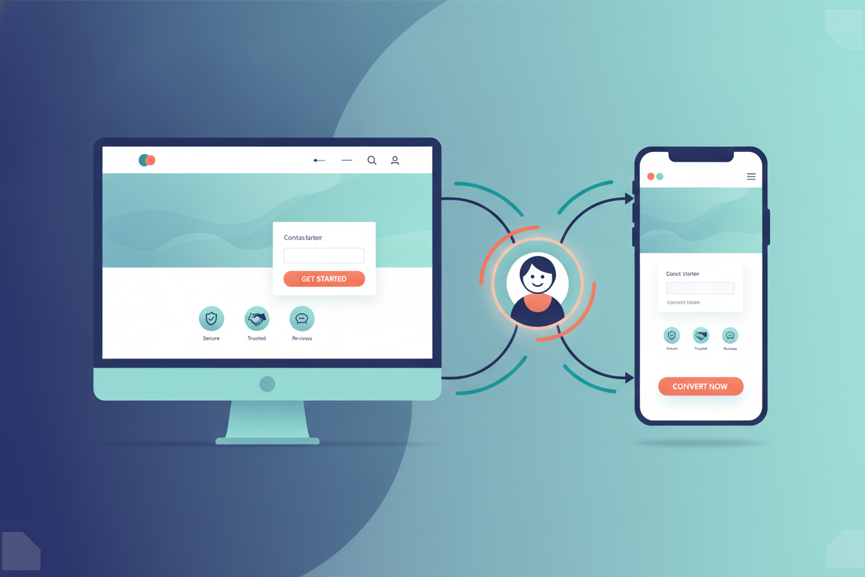
Match the call to action to the visitor’s readiness. Someone discovering a problem may want a checklist or explanation; someone comparing providers may want examples or a consultation; someone ready to act may want a short form, phone number, or booking link.
Keep forms focused. Ask only for information needed to respond, explain what happens after submission, and show an alternative contact method if the form fails. Place the primary action near the value proposition, after proof, and at the end of useful articles. On mobile, make tap targets generous and avoid forcing visitors to zoom or hunt through a menu.
5. Measure the system without chasing vanity metrics
Track a small set of signals that connect visibility to business outcomes:
- Organic entrances to key service and educational pages.
- Engagement with the primary call to action.
- Form starts, completions, and qualified inquiries.
- Top landing pages and the questions that bring visitors there.
- Technical performance and accessibility issues that block use.
Review the numbers monthly, then improve one bottleneck at a time. More traffic is not automatically progress if the message is unclear or the contact experience is broken. A page that attracts fewer visitors but produces better conversations may be doing more valuable work.
A practical 30-day implementation plan
- Days 1–7: Interview customers, clarify the homepage promise, and identify the primary conversion action.
- Days 8–14: Test the key pages on phones, compress large images, remove unnecessary plugins, and fix heading, link, and alt-text issues.
- Days 15–21: Map customer questions into three content themes and publish one cornerstone guide plus supporting answers.
- Days 22–30: Simplify the contact path, add proof where visitors hesitate, and establish a monthly measurement and refresh routine.
Final takeaway
A strong WordPress growth strategy is not a contest to publish the most pages or install the most tools. It is a connected system: clear positioning earns attention, useful content earns discovery, a fast accessible experience earns trust, and a well-designed next step earns the opportunity to help.
Start with the page that matters most to your business, fix its biggest point of friction, and use what you learn to improve the rest of the site.